The style notebook
Chanel Spring-Summer 2027 Double Pocket Flap Bag: Contrast Trim or Gold-Tone Bars?
Chanel Spring-Summer 2027 Double Pocket Flap Bag: contrast leather trim or gold-tone pocket bars, and how sleeves and jewellery change with each.
For the Chanel Spring-Summer 2027 Double Pocket Flap Bag, the two builds ask for opposite kinds of restraint. The contrasting leather frame is a colour decision, so the sleeve and jewellery stay quiet and one echo of the trim repeats the palette. The version with gold-tone bars is a hardware decision, so a plain sleeve does the work and the jewellery steps back rather than adding a second bright line.
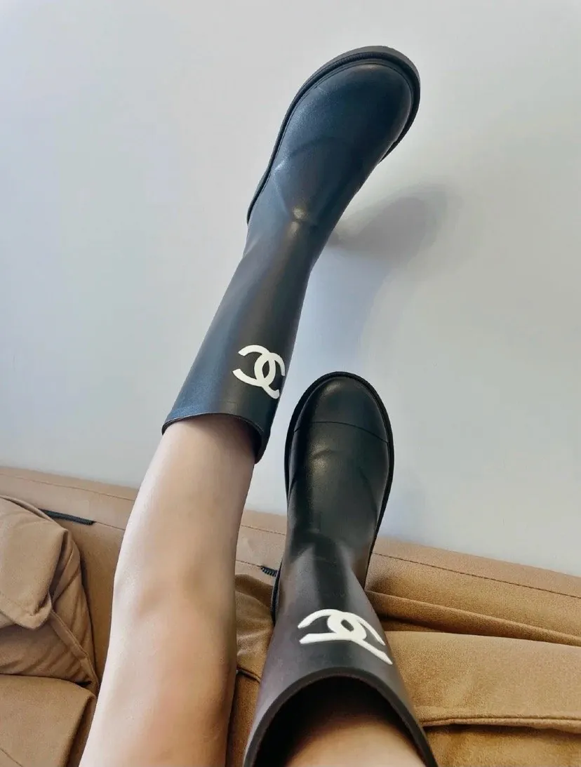
The featured image is an existing Chanel wardrobe reference, separate from the Double Pocket Flap Bag looks discussed here.
Anna McWhirter’s report for PurseBop describes the Double Pocket Flap Bag with two stacked front pockets in flat quilted leather and a CC turn-lock securing the upper pocket beneath the main flap. Contrasting leather frames the construction, and the design appears in two-tone colourways that emphasise the double-pocket layout. A bolder version replaces the leather framing with gold-tone metal bars trimming the base of each front pocket. Those are the reported details; the clothing and jewellery calls below are my styling reading of them.
Why the sleeve matters more than the collar
The pockets sit stacked on the front face, so the eye moves down the bag rather than across the top edge. When you carry it by a chain or hold it at the front of the body, the forearm and sleeve pass directly beside that stacked geometry. A sleeve with a wide cuff, a bell shape, a gathered wrist or a heavy rib ends up at the same level as the lower pocket edge, and the clean line of the trim gets muddled.
A plain sleeve, set-in and straight to the wrist with a simple button cuff or none, leaves the pocket edges visible as two parallel shapes. That holds for a fine-knit crew neck, a flat silk blouse, a crisp cotton shirt or a smooth wool jacket. Raglan sleeves work too if the shoulder line stays clean. Avoid decoration at the wrist: a flared cuff, a ruffle, a contrast turn-back or a stack of bangles over a tight sleeve.
The contrast-trim bag: control the colour echo
With contrasting leather framing the pockets, the bag already carries two colours, and the two-tone colourway does the same job at a larger scale. The outfit does not need to match it. One controlled echo is enough — a shoe, a belt, a knit — so the trim reads as part of a considered palette rather than a stray detail.
- A black-trimmed bag over a cream or oatmeal outfit: repeat the dark note at the shoe or a slim belt, and keep jewellery in one metal.
- A two-tone bag in a light body with a deeper frame: borrow the deeper tone for a fine-knit top or a scarf, not both, and leave the trousers neutral.
- A bag where the trim is the only strong colour: treat it as the accent, wear one other piece in a related tone, then stop.
Jewellery here can afford a little more presence than with the bar version, because the trim is made of the same leather material as the bag rather than a reflective metal. A single chain necklace, a pair of small gold hoops or a signet ring keeps the look intentional without fighting the frame. Two pieces in different metals is where it starts to feel busy.
The gold-tone bar bag: plain sleeve, quiet jewellery
Gold-tone bars trim the base of each pocket, so the bag has a bright horizontal line low on the front and a warm metal note against the quilted leather. A second gold element near the face or the wrist competes with that line. Let the bars be the only warm hardware you wear.
Keep the sleeve simple and skip the bracelet or watch with a gold-tone case if you want the bars to stay the focal point. A plain silver band, a leather-strap watch or no wrist jewellery leaves the bag’s hardware alone. Plain cuffs in a matte fabric — wool, cotton, flat silk — read cleaner beside polished metal than a shiny satin or a metallic-thread knit, which would answer the bars with more shine.
For necklines, a crew or a shirt collar works better than a deep V with a long gold pendant, which would pull the eye up and away from the pocket line. If you want jewellery at all, a small earring or a thin chain in a cooler metal keeps the two zones separate.
Fabric choices that hold for either version
Flat quilted leather has a soft, even surface. Smooth fabrics let the quilting and the pocket edges read clearly: fine wool, cotton poplin, flat silk, matte crepe, a plain cashmere knit. Textured fabrics — heavy tweed, cable knit, sequins, shirring — fill the same visual space and the pocket geometry disappears into the noise.
If you want texture, put it below the waist where it is away from the bag, such as a textured trouser or a pleated skirt, and keep the top half smooth. For more on building a plain base that lets a structured bag lead, see how to style a black shoulder bag with wide-leg trousers.
Choosing between the two builds
Pick the contrast-trim version if your wardrobe already runs on two-colour combinations and you like a bag that joins a palette. It is the easier one to repeat across outfits because the colour echo gives you a rule to follow: one matching note, then neutral everything else. Pick the gold-tone bar version if you wear mostly single-colour clothing and want one warm metal detail to carry the look. It rewards a plainer sleeve and less jewellery, which suits a wardrobe that is already quiet.
Before committing, try the bag with the sleeves you actually wear in the season you plan to carry it — the cuff you see most often is the one that has to sit beside those stacked pockets.