The style notebook
Loro Piana Spring 2026: Building a Wardrobe From 16 Shades of Cashmere Knitwear
Loro Piana Spring 2026's 16-shade cashmere knitwear palette: how many knits and which tones to choose, plus muesli tailoring and printed-piece pairings.
For the Loro Piana Spring 2026 knitwear palette, the working answer is three: one base tone, one mid-tone a clear step away from it, and one accent. A fourth knit earns its place only by changing weight or neckline rather than colour. Vogue's Luke Leitch (25 September 2025) reports that the house presented a “library” of knitwear — 16 shades of cashmere, designed as a palette to be built into wardrobes. That single sentence is the reported fact, and it is worth holding at arm's length, because a 16-shade library tells you how the house framed the offer, not which shades will work in your wardrobe. The reasoning below is my own reading for anyone choosing a small set rather than collecting the range.
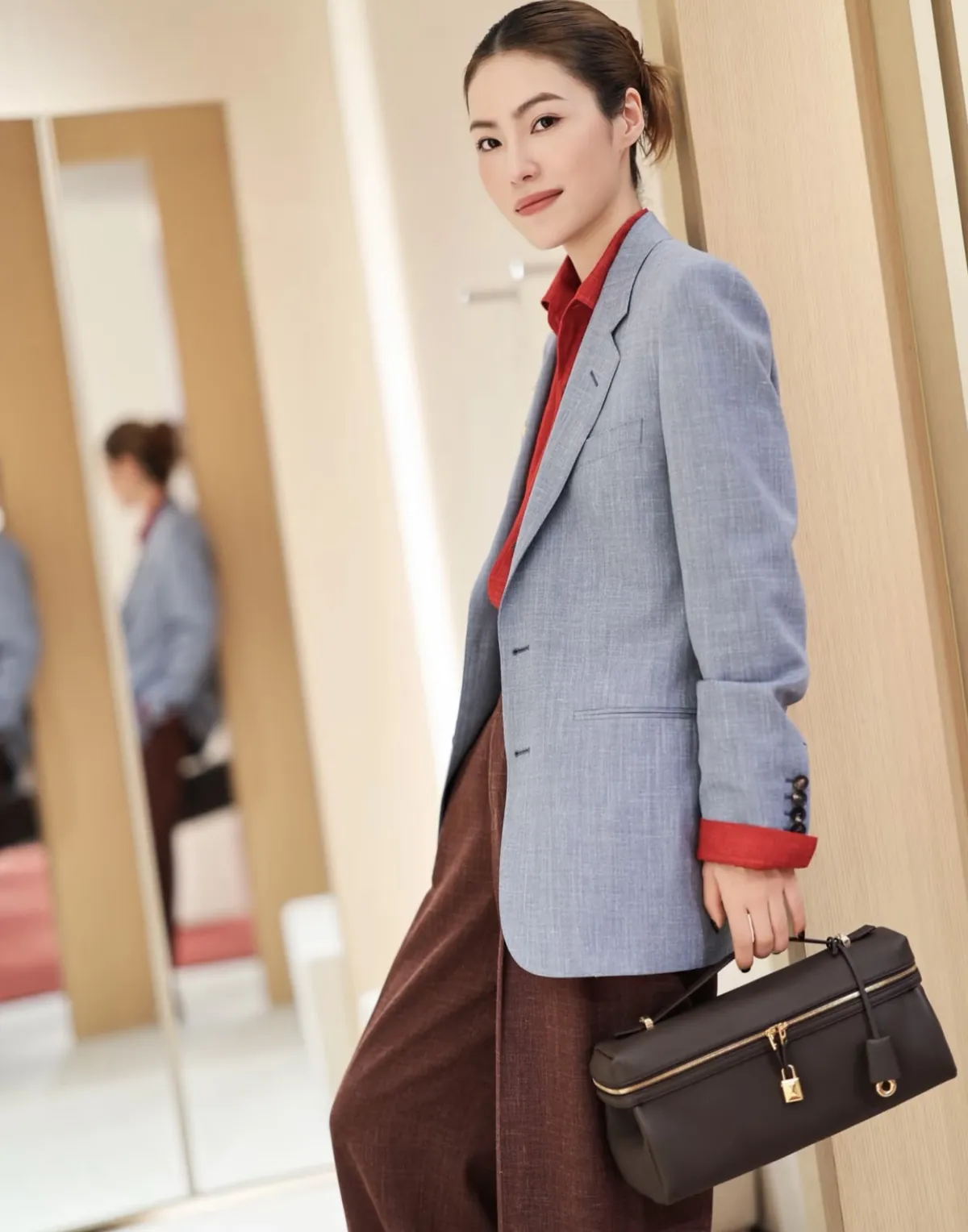
The featured image is an existing Loro Piana wardrobe reference, separate from the Spring 2026 looks discussed here.
Three knits, three jobs
Sixteen is a menu. The predictable error is buying five soft neutrals at nearly the same value, which look interchangeable on a shelf and interchangeable on a body. Split the choice by function instead:
- Base: a tone you would be happy to wear with everything you already own, light or dark. It is the default knit, so pick for repeat wear rather than for the shelf.
- Mid-tone: noticeably different from the base in depth, not in temperature. It rescues a single-tone outfit without introducing a second colour idea.
- Accent: the one shade that does what a scarf would do — carries the colour so the clothing stays plain.
Two is a starter set. Four makes sense only when the fourth is a different garment in the wearing sense: a fine crew and a heavier ribbed knit in the same base tone cover different weather and sit differently under a jacket, so they are not duplicates even if the label shade matches. Two fine crews in adjacent neutrals are duplicates.
The base knit against muesli tailoring
Leitch describes the season's tailoring in “gentle muesli tones,” including shawl-collared blazers buttoned low, double-breasted cash-silk blousons and summer tweeds woven in silk, cut to a mildly loose silhouette. Those details govern the knit more than any colour chart does.
A low-buttoned shawl blazer leaves a wide vertical opening at the chest, and a mildly loose cut leaves room in the body. A close crew or fine-gauge rollneck inside that opening lets the shawl collar do the work at the neck; a bulky knit competes for the same space and blunts the lapel. If your base knit sits close to muesli in warmth and lightness, knit and jacket merge into one soft column — the calmest version of the look, and the one that makes the knit read as texture rather than as a separate item.
Here is where I would choose differently. If you want the knit to be visible as the leading texture, do not put your base knit in the same family as the tailoring. Choose the deeper of your three tones for wear under muesli, and let the jacket frame it. That is a judgement about your own wardrobe, not a claim about which shades the presentation showed.
Which knit goes with printed dresses and coats
Printed dresses and coats with floral, watercolour and marine motifs are also reported for the season. Next to a print the knit's job inverts: it becomes the plain surface the pattern leans on. A fine solid knit drawn from the print's quietest ground colour under a printed coat keeps the knit as texture and the print as the event. A patterned knit is the wrong answer here — cashmere's own surface is already the interest, and a second pattern splits the eye.
Where a knit is worn small and briefly — over the shoulders, at the neck — use the accent, not the base. A small area of stronger colour reads with authority precisely because it is small. If prints are central to your wardrobe and you buy only one accent, a marine-family shade is a defensible choice: it answers marine-motif prints and the reported marine-blue outerwear in the menswear offering without matching either literally. That is a pairing suggestion, not a report on the palette's contents.
How to spend across the three
Put the most into the base, because it is the one you will wear until it wears out, and into the accent, because it is the one people notice. A thinner or simpler mid-tone still does its job, since it rarely leads an outfit. If you must stop somewhere, stop at the mid-tone: it is the slot most likely to be filled twice with near-identical results.
Before committing to a tone, hold the knit in daylight next to the trousers, coat or printed piece you would actually wear it with. That is a conditional check you make yourself, not a claim about how the fabric behaves. For a day-to-dinner view of knitwear with trousers, the holiday knitwear and trousers guide covers another season but the same layering logic. And the marine-blue field coat set shows how one deep tone can carry a tonal outfit with no second colour at all — a useful reference if your accent knit is the only strong note in the look.