The style notebook
Loro Piana Spring 2026 Printed Dresses and Coats: Floral and Marine Motif Outfit Ideas
Loro Piana Spring 2026 printed dresses and coats: choose whether the dress or coat carries the floral or marine motif, and the plain cashmere under it.
For Loro Piana Spring 2026, the print should sit on the dress by default, with a solid coat over it, and the motif should move to the coat only when the coat is what stays on all day indoors. Vogue's Luke Leitch (25 September 2025) reports simply that “printed dresses and coats featured floral, watercolor and marine motifs,” shown in the galleries of the reopened Palazzo Citterio. That is the reported fact: prints on both garment types, in soft botanical and sea-life registers. The placement reasoning below is my own reading for anyone deciding which piece carries the pattern, and the print-versus-knit balance is an editorial judgement rather than a claim about how the fabrics behave.
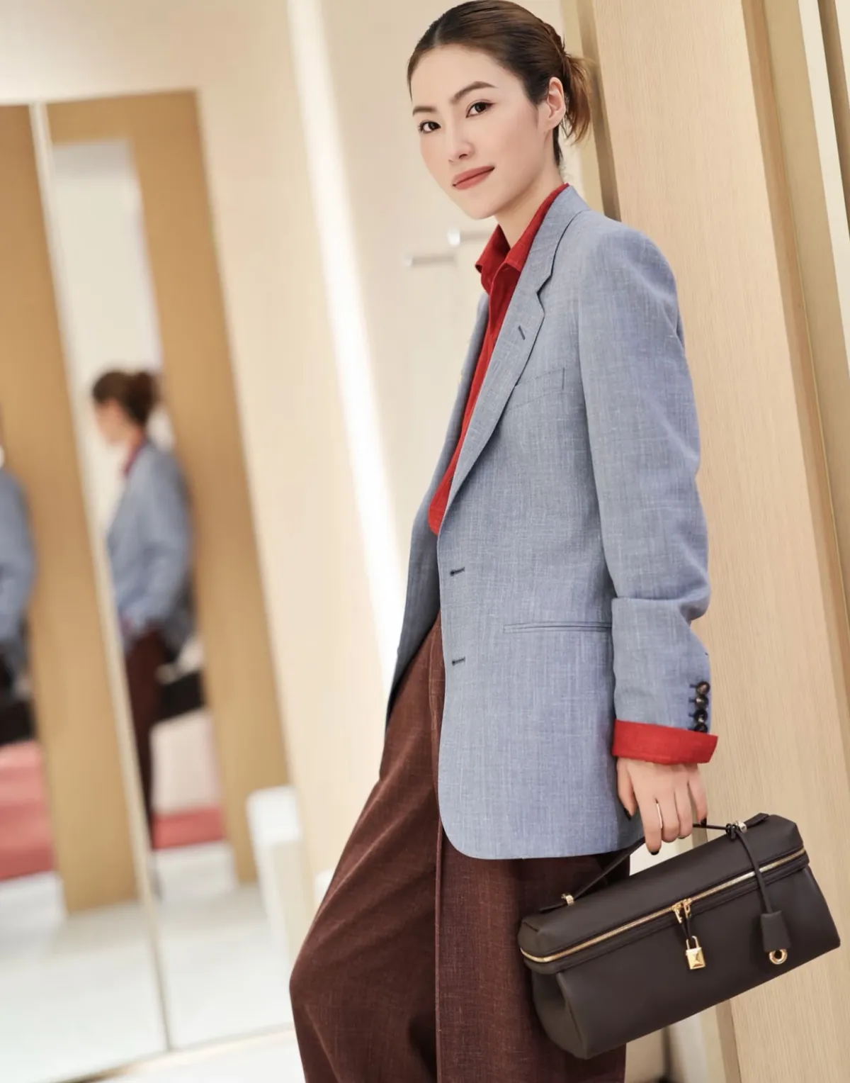
The featured image is an existing Loro Piana wardrobe reference, separate from the Spring 2026 looks discussed here.
Let the dress hold the print and the coat stay plain
A printed dress under a solid coat is the more flexible combination because it works the print in and out of view. Open the coat and the motif is the outfit; button it and the coat takes over. That gives one purchase two registers, and it means the print does not have to carry the whole look every time you leave the house.
This is where the marine motifs differ from the florals. A watercolor floral reads as decoration across a broad surface and wants room, so the dress is the natural home for it. A marine motif is tighter and more graphic, and it holds up well when it is only glimpsed at a neckline or below a hem. Either way, a plain coat gives the pattern an edge to sit against rather than another pattern to argue with.
Keep the coat's own character quiet: a single solid tone, no secondary check or stripe, and a surface that does not compete in texture with the print. If you are choosing a coat to wear specifically over prints, that plainness is the whole job.
When the coat should carry the print instead
The reverse choice makes sense when the coat is the piece that stays on. If you spend the day in a coat — over trousers, over a skirt, carried on a chair — a printed coat earns its keep because it is the garment people actually see. A printed dress hidden beneath a plain coat would then be doing nothing.
There is a proportion point here. The season's reported womenswear silhouette is “elongated and relatively ladylike-meets-staid,” set on mostly flat shoes. An elongated printed coat spreads a watercolor or floral motif over a long field, which reads as a fabric statement rather than a small decorative accent. If that is the effect you want, put the print on the coat and keep everything underneath solid. If you want the print to feel like a detail rather than a garment, keep it on the dress.
The marine motif suits the coat less comfortably in my reading, because a graphic motif repeated across a long outer layer can read as a uniform. A tighter floral or watercolor treatment gives the eye more variation down the length.
The plain cashmere beneath, drawn from the knit library
Leitch reports that Loro Piana presented a “library” of knitwear — 16 shades of cashmere, designed as a palette to be built into wardrobes. That library is the practical answer to the question of what goes under a printed piece: a plain cashmere knit in a single shade, chosen to sit one step away from the print's dominant tone rather than match it exactly.
Three approaches work:
- Echo the ground: pick a knit close to the pale base colour of a watercolor motif. The print then floats on a near-continuous field and the outfit reads tonal.
- Step darker: choose a knit a clear shade deeper than the print's lightest tone. This gives the printed piece a frame at the neckline and stops the whole look going uniformly pastel.
- Warm neutral: a knit in the muesli family Leitch associates with the season's tailoring keeps the print as the only colour idea in the outfit.
Avoid putting a second pattern or a strongly contrasting knit under a print. The library's value here is that it offers many close neutrals, which is exactly what a printed garment needs beneath it — not a competing accent.
Hats, shoes and the finish
Leitch notes the season was “zhooshed by eccentrically expressive hats,” including coned shapes. With a printed dress or coat, a hat is best kept plain in colour so the print remains the one decorated surface. The same holds for flat shoes, which the report places under the elongated silhouette: a quiet flat lets a long printed line run uninterrupted.
If you want a second reference point on balancing a printed piece against plain outerwear, the guide to a quilted coat with a floral skirt works through a similar solid-over-print logic from a different house. The decision here is simply which of the two Loro Piana pieces should be the one carrying the motif — and for most wardrobes, that is the dress, with the coat doing the quiet work.