The style notebook
Prada Spring/Summer 2026 Red and Orange Outfits: Blouses, Pencil Skirts and Knitwear
Prada Spring/Summer 2026 red-orange styling: how a warm red blouse and orange pencil skirt read deliberate, with the Saint Laurent look that inspired it.
For Prada Spring/Summer 2026 red and orange, the useful distinction is this: the warm two-colour idea is a reported Saint Laurent formula, while Prada's own Spring/Summer 2026 role in the story is to place red at the centre of a wider colour-matching experiment. Vogue Korea's styling feature, published 7 November 2025 by 하솔휘, sets Prada within that broader red-focused runway moment and then, in its red-and-orange section, credits Saint Laurent with a red blouse matched to an orange pencil skirt for a look with an overall warm glow. The general advice in the same section is that matching the two colours at the same temperature makes the pairing easier. Keep those two things separate: Saint Laurent supplied the specific blouse-and-skirt combination; Prada supplied the season's red-led colour-matching frame. My fabric, shoe and bag judgements below are styling interpretation of that reported advice, not product testing.
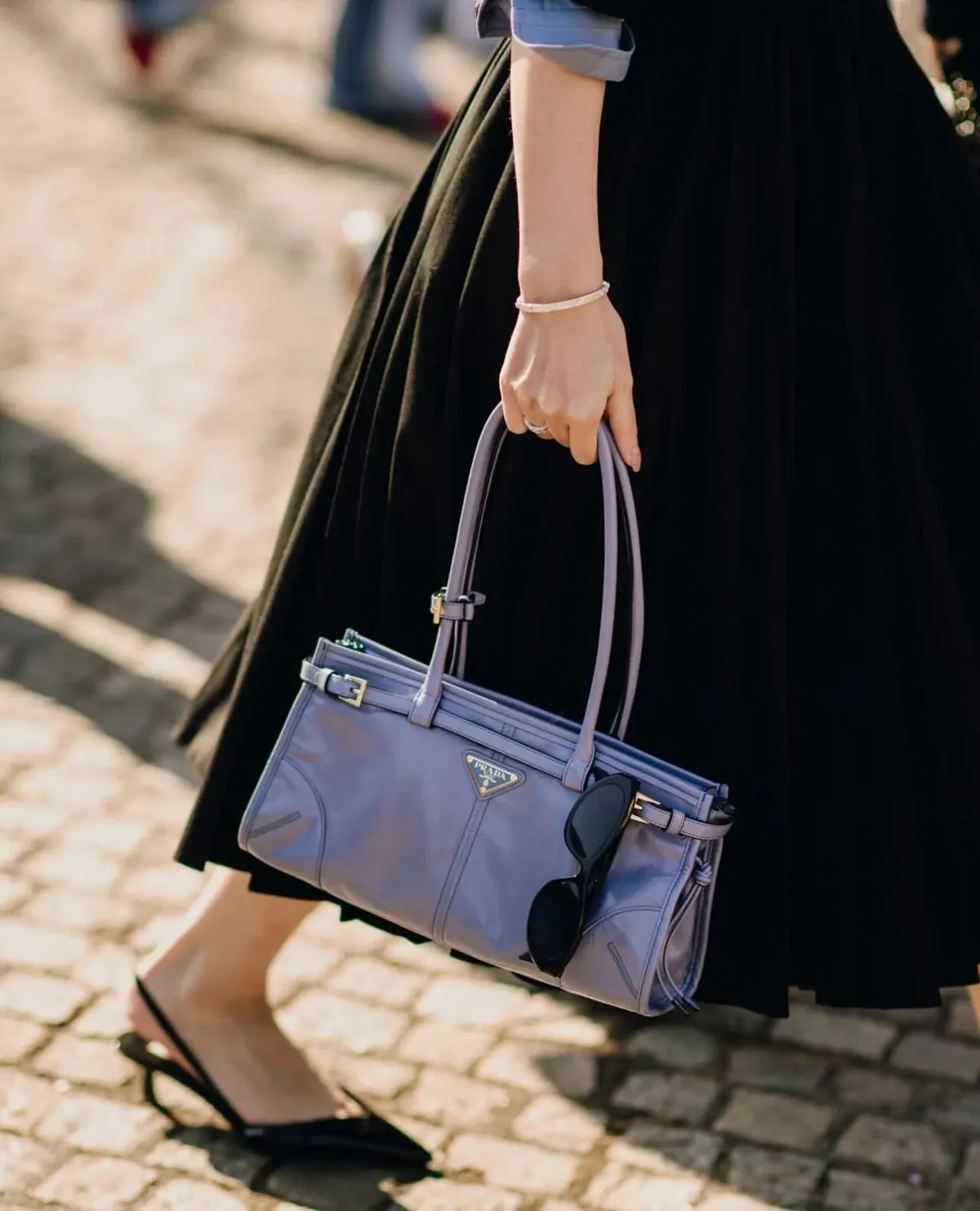
The featured image is an existing Prada wardrobe reference, separate from the Spring/Summer 2026 looks discussed here.
Start with the colour temperature, not the shade names
Red and orange sit close enough on the wheel that they either look related or look like an argument. The reported rule — match them at the same temperature — is the one that decides which. A warm, slightly browned red against a warm orange reads as two depths of one glow; a blue-leaning red against a hot tangerine reads as two separate statements. My interpretation is that this is a test you can run on the pair you already own: put the blouse and skirt together in daylight and ask whether they pull toward the same warmth. If they do, the outfit is doing the tonal thing the source describes. If one looks cool beside the other, no amount of quiet accessorising will reconcile them, and you are better off changing one piece than adding a third colour to mediate.
Let fabric do the separating work
When two warm colours sit that close, fabric is what stops them blurring into a single orange-red mass. The reported look is a blouse with a pencil skirt, and a pencil skirt gives a close, clean vertical through the hip and leg — quite different from a bias slip or a full skirt that moves away from the body. My reading is that a soft, matte or lightly textured blouse keeps the red from reading as a shiny accessory, while a skirt with enough body to hold its line gives the lower half a firm edge. Two high-sheen pieces — satin against satin, for instance — let the warm colours bounce and can tip the look toward costume. A matte-above, slightly firmer-below mix is the calmer arrangement.
Shoes: extend the warmth or give it a base
The clothing has already done the colour work; the shoe should not introduce a third temperature. There are two sensible routes. One continues the warmth — a deep brown or a muted caramel that agrees with the orange and carries the glow down the leg. The other steps back with black, which the source treats as the reliable neutral for red elsewhere in the story and which gives the outfit a grounded base. Either is a real choice; the difference is whether you want the look to blend downward or to end cleanly at the ankle. A cool metallic or a crisp white shoe is the one I would leave out, because each adds a temperature the clothes have just spent effort reconciling.
The bag should be the quietest object in the outfit
A pencil skirt already provides the sharpened centre of the look, so the bag should not compete for that role. Plain leather in black, deep brown or a muted tan keeps the red-and-orange pairing as the single idea. A small, structured shape can echo the skirt's line; a large slouchy bag adds a soft mass next to a tailored skirt and weakens the contrast the outfit is built on. If you want the bag to nod to the orange, choose a leather that reads browner and deeper than the skirt so it supports the colour rather than repeating it flatly. This is my styling preference, not a described property of any bag.
The broader point the source makes about red is that its energy tires quickly when it is too openly exposed, and is best tuned through tone, fabric and combination. A red blouse and an orange skirt already supply plenty of that energy; a plain neckline, a quiet shoe and a restrained bag are what keep the pairing looking chosen rather than loud. If you are weighing a specific blouse and skirt, lay them over each other in natural light before committing — a conditional check, not a promise of how they will look once worn. For the cooler Prada route through the same season, see the red and grey suit guide, where grey does the moderating that a second warm colour cannot.